iOS 26 Liquid Glass: Comprehensive Swift/SwiftUI Reference
https://conor.fyi/writing/liquid-glass-reference
Overview
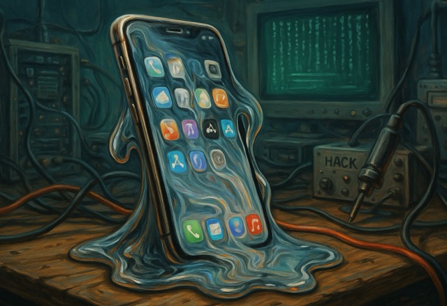
iOS 26 Liquid Glass represents Apple’s most significant design evolution since iOS 7, introduced at WWDC 2025 (June 9, 2025). Liquid Glass is a translucent, dynamic material that reflects and refracts surrounding content while transforming to bring focus to user tasks. This unified design language spans iOS 26, iPadOS 26, macOS Tahoe 26, watchOS 26, tvOS 26, and visionOS 26.
Liquid Glass features real-time light bending (lensing), specular highlights responding to device motion, adaptive shadows, and interactive behaviors. The material continuously adapts to background content, light conditions, and user interactions, creating depth and hierarchy between foreground controls and background content.
Key Characteristics:
- Lensing: Bends and concentrates light in real-time (vs. traditional blur that scatters light)
- Materialization: Elements appear by gradually modulating light bending
- Fluidity: Gel-like flexibility with instant touch responsiveness
- Morphing: Dynamic transformation between control states
- Adaptivity: Multi-layer composition adjusting to content, color scheme, and size
Part 1: Foundation \u0026 Basics
1.1 Core Concepts
Design Philosophy
Liquid Glass is exclusively for the navigation layer that floats above app content. Never apply to content itself (lists, tables, media). This maintains clear visual hierarchy: content remains primary while controls provide functional overlay.
Material Variants
| Variant |
Use Case |
Transparency |
Adaptivity |
.regular |
Default for most UI |
Medium |
Full - adapts to any content |
.clear |
Media-rich backgrounds |
High |
Limited - requires dimming layer |
.identity |
Conditional disable |
None |
N/A - no effect applied |
When to Use Each Variant:
- Regular: Toolbars, buttons, navigation bars, tab bars, standard controls
- Clear: Small floating controls over photos/maps with bold foreground content
- Identity: Conditional toggling (e.g.,
glassEffect(isEnabled ? .regular : .identity))
Design Requirements for Clear Variant (all must be met):
- Element sits over media-rich content
- Content won’t be negatively affected by dimming layer
- Content above glass is bold and bright
1.2 Basic Implementation
Simple Glass Effect
import SwiftUI

struct BasicGlassView: View {
    var body: some View {
        Text("Hello, Liquid Glass!")
            .padding()
            .glassEffect()  // Default: .regular variant, .capsule shape
    }
}
With Explicit Parameters
Text("Custom Glass")
    .padding()
    .glassEffect(.regular, in: .capsule, isEnabled: true)
API Signature
func glassEffect<S: Shape>(
    _ glass: Glass = .regular,
    in shape: S = DefaultGlassEffectShape,
    isEnabled: Bool = true
) -> some View
1.3 Glass Type Modifiers
Core Structure
struct Glass {
    static var regular: Glass
    static var clear: Glass
    static var identity: Glass

    func tint(_ color: Color) -> Glass
    func interactive() -> Glass
}
Tinting
// Basic tint
Text("Tinted")
    .padding()
    .glassEffect(.regular.tint(.blue))

// With opacity
Text("Subtle Tint")
    .padding()
    .glassEffect(.regular.tint(.purple.opacity(0.6)))
Purpose: Convey semantic meaning (primary action, state), NOT decoration. Use selectively for call-to-action only.
Interactive Modifier (iOS only)
Button("Tap Me") {
    // action
}
.glassEffect(.regular.interactive())
Behaviors Enabled:
- Scaling on press
- Bouncing animation
- Shimmering effect
- Touch-point illumination that radiates to nearby glass
- Response to tap and drag gestures
Method Chaining
.glassEffect(.regular.tint(.orange).interactive())
.glassEffect(.clear.interactive().tint(.blue))  // Order doesn't matter
1.4 Custom Shapes
Available Shapes
// Capsule (default)
.glassEffect(.regular, in: .capsule)

// Circle
.glassEffect(.regular, in: .circle)

// Rounded Rectangle
.glassEffect(.regular, in: RoundedRectangle(cornerRadius: 16))

// Container-concentric (aligns with container corners)
.glassEffect(.regular, in: .rect(cornerRadius: .containerConcentric))

// Ellipse
.glassEffect(.regular, in: .ellipse)

// Custom shape conforming to Shape protocol
struct CustomShape: Shape {
    func path(in rect: CGRect) -> Path {
        // Custom path logic
    }
}
.glassEffect(.regular, in: CustomShape())
Corner Concentricity
Maintains perfect alignment between elements and containers across devices:
// Automatically matches container/window corners
RoundedRectangle(cornerRadius: .containerConcentric, style: .continuous)
1.5 Text \u0026 Icons with Glass
Text Rendering
Text("Glass Text")
    .font(.title)
    .bold()
    .foregroundStyle(.white)  // High contrast for legibility
    .padding()
    .glassEffect()
Text on glass automatically receives vibrant treatment - adjusts color, brightness, saturation based on background.
Icon Rendering
Image(systemName: "heart.fill")
    .font(.largeTitle)
    .foregroundStyle(.white)
    .frame(width: 60, height: 60)
    .glassEffect(.regular.interactive())
Labels
Label("Settings", systemImage: "gear")
    .labelStyle(.iconOnly)
    .padding()
    .glassEffect()
1.6 Accessibility Support
Automatic Adaptation - No code changes required:
- Reduced Transparency: Increases frosting for clarity
- Increased Contrast: Stark colors and borders
- Reduced Motion: Tones down animations and elastic effects
- iOS 26.1+ Tinted Mode: User-controlled opacity increase (Settings → Display & Brightness → Liquid Glass)
Environment Values
@Environment(\.accessibilityReduceTransparency) var reduceTransparency
@Environment(\.accessibilityReduceMotion) var reduceMotion

var body: some View {
    Text("Accessible")
        .padding()
        .glassEffect(reduceTransparency ? .identity : .regular)
}
Best Practice: Let system handle accessibility automatically. Don’t override unless absolutely necessary.
2.1 GlassEffectContainer
Purpose
- Combines multiple Liquid Glass shapes into unified composition
- Improves rendering performance by sharing sampling region
- Enables morphing transitions between glass elements
- Critical Rule: Glass cannot sample other glass; container provides shared sampling region
Basic Usage
GlassEffectContainer {
    HStack(spacing: 20) {
        Image(systemName: "pencil")
            .frame(width: 44, height: 44)
            .glassEffect(.regular.interactive())

        Image(systemName: "eraser")
            .frame(width: 44, height: 44)
            .glassEffect(.regular.interactive())
    }
}
With Spacing Control
GlassEffectContainer(spacing: 40.0) {
    // Glass elements within 40 points will morph together
    ForEach(icons) { icon in
        IconView(icon)
            .glassEffect()
    }
}
Spacing Parameter: Controls morphing threshold - elements within this distance visually blend and morph together during transitions.
API Signature
struct GlassEffectContainer<Content: View>: View {
    init(spacing: CGFloat? = nil, @ViewBuilder content: () -> Content)
    init(@ViewBuilder content: () -> Content)
}
2.2 Morphing Transitions with glassEffectID
Requirements for Morphing:
- Elements in same
GlassEffectContainer
- Each view has
glassEffectID with shared namespace
- Views conditionally shown/hidden trigger morphing
- Animation applied to state changes
Basic Morphing Setup
struct MorphingExample: View {
    @State private var isExpanded = false
    @Namespace private var namespace

    var body: some View {
        GlassEffectContainer(spacing: 30) {
            Button(isExpanded ? "Collapse" : "Expand") {
                withAnimation(.bouncy) {
                    isExpanded.toggle()
                }
            }
            .glassEffect()
            .glassEffectID("toggle", in: namespace)

            if isExpanded {
                Button("Action 1") { }
                    .glassEffect()
                    .glassEffectID("action1", in: namespace)

                Button("Action 2") { }
                    .glassEffect()
                    .glassEffectID("action2", in: namespace)
            }
        }
    }
}
API Signature
func glassEffectID<ID: Hashable>(
    _ id: ID,
    in namespace: Namespace.ID
) -> some View
Advanced Morphing Pattern - Expandable Action Menu
struct ActionButtonsView: View {
    @State private var showActions = false
    @Namespace private var namespace

    var body: some View {
        ZStack {
            Image("background")
                .resizable()
                .ignoresSafeArea()

            GlassEffectContainer(spacing: 30) {
                VStack(spacing: 30) {
                    // Top button
                    if showActions {
                        actionButton("rotate.right")
                            .glassEffectID("rotate", in: namespace)
                    }

                    HStack(spacing: 30) {
                        // Left button
                        if showActions {
                            actionButton("circle.lefthalf.filled")
                                .glassEffectID("contrast", in: namespace)
                        }

                        // Toggle (always visible)
                        actionButton(showActions ? "xmark" : "slider.horizontal.3") {
                            withAnimation(.bouncy) {
                                showActions.toggle()
                            }
                        }
                        .glassEffectID("toggle", in: namespace)

                        // Right button
                        if showActions {
                            actionButton("flip.horizontal")
                                .glassEffectID("flip", in: namespace)
                        }
                    }

                    // Bottom button
                    if showActions {
                        actionButton("crop")
                            .glassEffectID("crop", in: namespace)
                    }
                }
            }
        }
    }

    @ViewBuilder
    func actionButton(_ systemImage: String, action: (() -> Void)? = nil) -> some View {
        Button {
            action?()
        } label: {
            Image(systemName: systemImage)
                .frame(width: 44, height: 44)
        }
        .buttonStyle(.glass)
        .buttonBorderShape(.circle)
    }
}
Button Style Types
| Style |
Appearance |
Use Case |
.glass |
Translucent, see-through |
Secondary actions |
.glassProminent |
Opaque, no background show-through |
Primary actions |
Basic Implementation
// Secondary action
Button("Cancel") { }
    .buttonStyle(.glass)

// Primary action
Button("Save") { }
    .buttonStyle(.glassProminent)
    .tint(.blue)
With Customization
Button("Action") { }
    .buttonStyle(.glass)
    .tint(.purple)
    .controlSize(.large)
    .buttonBorderShape(.circle)
Available Control Sizes
.controlSize(.mini)
.controlSize(.small)
.controlSize(.regular)  // Default
.controlSize(.large)
.controlSize(.extraLarge)  // New in iOS 26
Border Shapes
.buttonBorderShape(.capsule)     // Default
.buttonBorderShape(.roundedRectangle(radius: 8))
.buttonBorderShape(.circle)
Known Issue (Beta): .glassProminent with .circle has rendering artifacts. Workaround:
Button("Action") { }
    .buttonStyle(.glassProminent)
    .buttonBorderShape(.circle)
    .clipShape(Circle())  // Fixes artifacts
Automatic Glass Styling
Toolbars automatically receive Liquid Glass treatment in iOS 26:
NavigationStack {
    ContentView()
        .toolbar {
            ToolbarItem(placement: .cancellationAction) {
                Button("Cancel", systemImage: "xmark") { }
            }

            ToolbarItem(placement: .confirmationAction) {
                Button("Done", systemImage: "checkmark") { }
            }
        }
}
Automatic Behaviors:
- Prioritizes symbols over text
.confirmationAction automatically gets .glassProminent style- Floating glass appearance
- Grouped layouts with visual separation
Toolbar Grouping with Spacing
.toolbar {
    ToolbarItemGroup(placement: .topBarTrailing) {
        Button("Draw", systemImage: "pencil") { }
        Button("Erase", systemImage: "eraser") { }
    }

    ToolbarSpacer(.fixed, spacing: 20)  // New in iOS 26

    ToolbarItem(placement: .topBarTrailing) {
        Button("Save", systemImage: "checkmark") { }
            .buttonStyle(.glassProminent)
    }
}
ToolbarSpacer Types
ToolbarSpacer(.fixed, spacing: 20)   // Fixed space
ToolbarSpacer(.flexible)              // Flexible space (pushes items apart)
Badge Modifier
ToolbarItem(placement: .topBarLeading) {
    Button("Notifications", systemImage: "bell") { }
        .badge(5)  // Red badge with count
        .tint(.red)
}
Shared Background Visibility
ToolbarItem {
    Button("Profile", systemImage: "person.circle") { }
        .sharedBackgroundVisibility(.hidden)  // No glass background
}
2.5 TabView with Liquid Glass
Basic TabView
Automatically adopts Liquid Glass when compiled with Xcode 26:
TabView {
    Tab("Home", systemImage: "house") {
        HomeView()
    }
    Tab("Settings", systemImage: "gear") {
        SettingsView()
    }
}
Search Tab Role
Creates floating search button at bottom-right (reachability optimization):
struct ContentView: View {
    @State private var searchText = ""

    var body: some View {
        TabView {
            Tab("Home", systemImage: "house") {
                HomeView()
            }

            Tab("Search", systemImage: "magnifyingglass", role: .search) {
                NavigationStack {
                    SearchView()
                }
            }
        }
        .searchable(text: $searchText)
    }
}
Tab Bar Minimize Behavior
TabView {
    // tabs...
}
.tabBarMinimizeBehavior(.onScrollDown)  // Collapses during scroll
Options:
.automatic - System determines.onScrollDown - Minimizes when scrolling.never - Always full size
Tab View Bottom Accessory
Adds persistent glass view above tab bar:
TabView {
    // tabs...
}
.tabViewBottomAccessory {
    HStack {
        Image(systemName: "play.fill")
        Text("Now Playing")
        Spacer()
    }
    .padding()
}
Environment Value
@Environment(\.tabViewBottomAccessoryPlacement) var placement
// Returns: .expanded or .collapsed
2.6 Sheet Presentations
Automatic Glass Background
Sheets in iOS 26 automatically receive inset Liquid Glass background:
.sheet(isPresented: $showSheet) {
    SheetContent()
        .presentationDetents([.medium, .large])
}
Sheet Morphing from Toolbar
struct ContentView: View {
    @Namespace private var transition
    @State private var showInfo = false

    var body: some View {
        NavigationStack {
            ContentView()
                .toolbar {
                    ToolbarItem(placement: .bottomBar) {
                        Button("Info", systemImage: "info") {
                            showInfo = true
                        }
                        .matchedTransitionSource(id: "info", in: transition)
                    }
                }
                .sheet(isPresented: $showInfo) {
                    InfoSheet()
                        .navigationTransition(.zoom(sourceID: "info", in: transition))
                }
        }
    }
}
Removing Custom Backgrounds
For iOS 26 glass effect, remove custom backgrounds:
// ❌ Old approach (iOS 18)
.presentationBackground(Color.white)

// ✅ New approach (iOS 26)
// Let system apply automatic glass - don't set custom background
Sheet Content Background Control
Form {
    // form content
}
.scrollContentBackground(.hidden)  // Remove default background for glass
.containerBackground(.clear, for: .navigation)
2.7 NavigationSplitView Integration
Automatic Floating Sidebar
NavigationSplitView {
    List(items) { item in
        NavigationLink(item.name, value: item)
    }
    .navigationTitle("Items")
} detail: {
    DetailView()
}
Sidebar automatically receives floating Liquid Glass with ambient reflection.
Background Extension Effect
NavigationSplitView {
    List(items) { item in
        NavigationLink(item.name, value: item)
    }
    .backgroundExtensionEffect()  // Extends beyond safe area
} detail: {
    DetailView()
}
2.8 Search Implementation
Toolbar Search
NavigationStack {
    ContentView()
}
.searchable(text: $searchText)
Search with Minimize Behavior
NavigationStack {
    ContentView()
}
.searchable(text: $searchText)
.searchToolbarBehavior(.minimized)
DefaultToolbarItem for Search (New API)
.toolbar {
    ToolbarItem(placement: .bottomBar) {
        DefaultToolbarItem(kind: .search, placement: .bottomBar)
    }
}
Part 3: Advanced Implementation
3.1 glassEffectUnion
Purpose: Manually combine glass effects that are too distant to merge via spacing alone.
API Signature
func glassEffectUnion<ID: Hashable>(
    id: ID,
    namespace: Namespace.ID
) -> some View
Requirements for Union:
- Elements must share same ID
- Elements must use same glass effect type
- Elements should have similar shapes
- All conditions must be met
Example
struct UnionExample: View {
    @Namespace var controls

    var body: some View {
        GlassEffectContainer {
            VStack(spacing: 0) {
                Button("Edit") { }
                    .buttonStyle(.glass)
                    .glassEffectUnion(id: "tools", namespace: controls)

                Spacer().frame(height: 100)  // Large gap

                Button("Delete") { }
                    .buttonStyle(.glass)
                    .glassEffectUnion(id: "tools", namespace: controls)
            }
        }
    }
}
Grouped Union Pattern
GlassEffectContainer {
    ForEach(0..<4) { index in
        Image(systemName: icons[index])
            .frame(width: 70, height: 70)
            .glassEffect()
            .glassEffectUnion(
                id: index < 3 ? "group1" : "group2",
                namespace: glassNamespace
            )
    }
}
First 3 icons blend together; 4th floats separately.
3.2 glassEffectTransition
API Signature
func glassEffectTransition(
    _ transition: GlassEffectTransition,
    isEnabled: Bool = true
) -> some View

enum GlassEffectTransition {
    case identity        // No changes
    case matchedGeometry // Matched geometry transition (default)
    case materialize     // Material appearance transition
}
Usage
Button("Action") { }
    .glassEffect()
    .glassEffectID("button", in: namespace)
    .glassEffectTransition(.materialize)
3.3 Complex Multi-Element Compositions
Floating Action Cluster
struct FloatingActionCluster: View {
    @State private var isExpanded = false
    @Namespace private var namespace

    let actions = [
        ("home", Color.purple),
        ("pencil", Color.blue),
        ("message", Color.green),
        ("envelope", Color.orange)
    ]

    var body: some View {
        ZStack {
            ContentView()

            VStack {
                Spacer()
                HStack {
                    Spacer()
                    cluster
                        .padding()
                }
            }
        }
    }

    var cluster: some View {
        GlassEffectContainer(spacing: 20) {
            VStack(spacing: 12) {
                if isExpanded {
                    ForEach(actions, id: \.0) { action in
                        actionButton(action.0, color: action.1)
                            .glassEffectID(action.0, in: namespace)
                    }
                }

                Button {
                    withAnimation(.bouncy(duration: 0.4)) {
                        isExpanded.toggle()
                    }
                } label: {
                    Image(systemName: isExpanded ? "xmark" : "plus")
                        .font(.title2.bold())
                        .frame(width: 56, height: 56)
                }
                .buttonStyle(.glassProminent)
                .buttonBorderShape(.circle)
                .tint(.blue)
                .glassEffectID("toggle", in: namespace)
            }
        }
    }

    func actionButton(_ icon: String, color: Color) -> some View {
        Button {
            // action
        } label: {
            Image(systemName: icon)
                .font(.title3)
                .frame(width: 48, height: 48)
        }
        .buttonStyle(.glass)
        .buttonBorderShape(.circle)
        .tint(color)
    }
}
3.4 Symbol Effects Integration
Smooth Icon Transitions
struct SymbolGlassButton: View {
    @State private var isLiked = false

    var body: some View {
        Button {
            isLiked.toggle()
        } label: {
            Image(systemName: isLiked ? "heart.fill" : "heart")
                .font(.title)
                .frame(width: 60, height: 60)
        }
        .glassEffect(.regular.interactive())
        .contentTransition(.symbolEffect(.replace))
        .tint(isLiked ? .red : .primary)
    }
}
Available Symbol Transitions:
.contentTransition(.symbolEffect(.replace))
.contentTransition(.symbolEffect(.automatic))
.contentTransition(.numericText())  // For numbers
Best Practices:
- Always Use GlassEffectContainer for Multiple Elements
// ✅ GOOD - Efficient rendering
GlassEffectContainer {
    HStack {
        Button("Edit") { }.glassEffect()
        Button("Delete") { }.glassEffect()
    }
}

// ❌ BAD - Inefficient, inconsistent sampling
HStack {
    Button("Edit") { }.glassEffect()
    Button("Delete") { }.glassEffect()
}
- Conditional Glass with .identity
.glassEffect(shouldShowGlass ? .regular : .identity)
No layout recalculation when toggling.
- Limit Continuous Animations
Let glass rest in steady states. Avoid:
// ❌ Continuous rotation
.rotationEffect(Angle(degrees: rotationAmount))
.animation(.linear(duration: 2).repeatForever(), value: rotationAmount)
- Test on Older Devices
- iPhone 11-13: May show lag
- Profile with Instruments for GPU usage
- Monitor thermal performance
3.6 Dynamic Glass Adaptation
Automatic Color Scheme Switching
Glass automatically adapts between light/dark based on background:
ScrollView {
    Color.black.frame(height: 400)  // Glass becomes light
    Color.white.frame(height: 400)  // Glass becomes dark
}
.safeAreaInset(edge: .bottom) {
    ControlPanel()
        .glassEffect()  // Automatically adapts
}
Adaptive Behaviors:
- Small elements (nav bars, tab bars): Flip between light/dark
- Large elements (sidebars, menus): Adapt but don’t flip (would be jarring)
- Shadows: Opacity increases over text, decreases over white backgrounds
- Tint: Adjusts hue, brightness, saturation for legibility
3.7 Custom Glass Navigation
Floating Sidebar Pattern
struct CustomNavigationView: View {
    @State private var selectedItem: Item?
    @Namespace private var namespace

    var body: some View {
        ZStack(alignment: .leading) {
            DetailView(item: selectedItem)
                .frame(maxWidth: .infinity, maxHeight: .infinity)

            if showSidebar {
                GlassEffectContainer {
                    VStack(alignment: .leading, spacing: 0) {
                        ForEach(items) { item in
                            NavigationButton(item: item, isSelected: item.id == selectedItem?.id) {
                                withAnimation {
                                    selectedItem = item
                                }
                            }
                            .glassEffectID(item.id, in: namespace)
                        }
                    }
                    .frame(width: 280)
                    .glassEffect(.regular, in: RoundedRectangle(cornerRadius: 20))
                }
                .padding()
                .transition(.move(edge: .leading).combined(with: .opacity))
            }
        }
    }
}
3.8 Gesture Integration
Drag Gesture with Glass
struct DraggableGlassButton: View {
    @State private var offset = CGSize.zero
    @State private var isDragging = false

    var body: some View {
        Button("Drag Me") { }
            .glassEffect(.regular.interactive())
            .offset(offset)
            .scaleEffect(isDragging ? 1.1 : 1.0)
            .gesture(
                DragGesture()
                    .onChanged { value in
                        isDragging = true
                        offset = value.translation
                    }
                    .onEnded { _ in
                        withAnimation(.spring(response: 0.3, dampingFraction: 0.6)) {
                            isDragging = false
                            offset = .zero
                        }
                    }
            )
    }
}
3.9 Custom Glass Text (CoreText)
Advanced Technique - Convert text to paths:
import CoreText

extension View {
    func glassText(_ text: String, font: UIFont) -> some View {
        let path = createTextPath(text, font: font)
        return self.glassEffect(.clear, in: path)
    }
}

func createTextPath(_ string: String, font: UIFont) -> Path {
    var path = Path()
    let attributedString = NSAttributedString(
        string: string,
        attributes: [.font: font]
    )
    let line = CTLineCreateWithAttributedString(attributedString)
    let runs = CTLineGetGlyphRuns(line) as! [CTRun]

    for run in runs {
        let glyphCount = CTRunGetGlyphCount(run)
        for index in 0..<glyphCount {
            var glyph = CGGlyph()
            CTRunGetGlyphs(run, CFRange(location: index, length: 1), &glyph)

            if let glyphPath = CTFontCreatePathForGlyph(font, glyph, nil) {
                path.addPath(Path(glyphPath))
            }
        }
    }

    return path
}
Part 4: Edge Cases \u0026 Advanced Topics
4.1 Handling Complex Background Content
The Readability Problem
Liquid Glass over busy, colorful, or animated content causes readability issues.
Solution 1: Gradient Fade
struct TabBarFadeModifier: ViewModifier {
    let fadeLocation: CGFloat = 0.4
    let opacity: CGFloat = 0.85
    let backgroundColor: Color = Color(.systemBackground)

    func body(content: Content) -> some View {
        GeometryReader { geometry in
            ZStack {
                content

                if geometry.safeAreaInsets.bottom > 10 {
                    let dynamicHeight = geometry.safeAreaInsets.bottom

                    VStack {
                        Spacer()
                        LinearGradient(
                            gradient: Gradient(stops: [
                                .init(color: .clear, location: 0.0),
                                .init(color: backgroundColor.opacity(opacity), location: fadeLocation)
                            ]),
                            startPoint: .top,
                            endPoint: .bottom
                        )
                        .frame(height: dynamicHeight)
                        .allowsHitTesting(false)
                        .offset(y: geometry.safeAreaInsets.bottom)
                    }
                }
            }
        }
    }
}

extension View {
    func deliquify() -> some View {
        self.modifier(TabBarFadeModifier())
    }
}

// Usage
ScrollView {
    ColorfulContent()
}
.deliquify()
Solution 2: Strategic Tinting
// Add color for better visibility
.glassEffect(.regular.tint(.purple.opacity(0.8)))
Solution 3: Choose Appropriate Variant
- Regular: Most contexts
- Clear: Only for media-rich content with bold foreground
Solution 4: Background Dimming
ZStack {
    BackgroundImage()
        .overlay(Color.black.opacity(0.3))  // Subtle dimming

    GlassControls()
        .glassEffect(.clear)
}
4.2 Glass Layering Guidelines
Avoid Glass-on-Glass
// ❌ BAD - Confusing visual hierarchy
VStack {
    HeaderView().glassEffect()
    ContentView().glassEffect()
    FooterView().glassEffect()
}

// ✅ GOOD - Clear separation
ZStack {
    ContentView()  // No glass
    HeaderView().glassEffect()  // Single floating layer
}
Proper Layering Philosophy:
- Content layer (bottom) - No glass
- Navigation layer (middle) - Liquid Glass
- Overlay layer (top) - Vibrancy and fills on glass
Cross-Platform Adaptations
| Platform |
Adaptations |
| iOS |
Floating tab bars, bottom search placement |
| iPadOS |
Floating sidebars, ambient reflection, larger shadows |
| macOS |
Concentric window corners, adaptive search bars, taller controls |
| watchOS |
Location-aware widgets, fluid navigation |
| tvOS |
Focused glass effects, directional highlights |
Minimum Requirements:
- iOS 26.0+
- iPadOS 26.0+
- macOS Tahoe (26.0)+
- watchOS 26.0+
- tvOS 26.0+
- visionOS 26.0+
- Xcode 26.0+
Device Support:
- iOS 26: iPhone 11 or iPhone SE (2nd gen) or later
- Older devices: Receive frosted glass fallback with reduced effects
4.4 Backward Compatibility
Automatic Adoption
Simply recompile with Xcode 26 - no code changes required for basic adoption.
Temporary Opt-Out (expires iOS 27)
<key>UIDesignRequiresCompatibility</key>
<true/>
Custom Compatibility Extension
extension View {
    @ViewBuilder
    func glassedEffect(
        in shape: some Shape = Capsule(),
        interactive: Bool = false
    ) -> some View {
        if #available(iOS 26.0, *) {
            let glass = interactive ? Glass.regular.interactive() : .regular
            self.glassEffect(glass, in: shape)
        } else {
            // Fallback for iOS 18
            self
                .background(
                    shape
                        .fill(.ultraThinMaterial)
                        .overlay(
                            LinearGradient(
                                colors: [.white.opacity(0.3), .clear],
                                startPoint: .topLeading,
                                endPoint: .bottomTrailing
                            )
                        )
                        .overlay(shape.stroke(.white.opacity(0.2), lineWidth: 1))
                )
        }
    }
}

// Usage
Text("Compatible")
    .padding()
    .glassedEffect(in: Capsule(), interactive: true)
4.5 UIKit Integration
UIGlassEffect
import UIKit

let glassEffect = UIGlassEffect(
    glass: .regular,
    isInteractive: true
)

let effectView = UIVisualEffectView(effect: glassEffect)
effectView.frame = CGRect(x: 0, y: 0, width: 200, height: 50)
view.addSubview(effectView)
UIGlassContainerEffect
let containerEffect = UIGlassContainerEffect()
let containerView = UIVisualEffectView(effect: containerEffect)
UIButton with Glass
var configuration = UIButton.Configuration.filled()
configuration.baseBackgroundColor = .systemBackground
let button = UIButton(configuration: configuration)
// System automatically applies glass when appropriate
UIKit Best Practices:
- Remove custom backgrounds to showcase glass
- Update presentation controllers for sheets
- Handle
UIBarButtonItem sizing for glass context
- Use
hidesSharedBackground = true to remove glass from specific items
4.6 Known Issues \u0026 Workarounds
Issue 1: Interactive Shape Mismatch
Problem: .glassEffect(.regular.interactive(), in: RoundedRectangle()) responds with Capsule shape
Status: Known beta issue
Workaround: Use .buttonStyle(.glass) for buttons instead
Issue 2: glassProminent Circle Artifacts
Problem: Rendering artifacts with .glassProminent and .circle
Workaround:
Button("Action") { }
    .buttonStyle(.glassProminent)
    .buttonBorderShape(.circle)
    .clipShape(Circle())  // Fixes artifacts
Issue 3: Widget Backgrounds
Problem: Widgets show black background in Standard/Dark modes
Status: No complete solution yet
Partial Solution: Tinted and Transparent modes work with Color.clear
Issue 4: Navigation Animation
Problem: Disorienting ToolbarItem animation during navigation
Solution:
ToolbarItem(id: "constantID") {
    Button("Done") { }
}
Battery Impact
- iOS 26: 13% battery drain vs. 1% in iOS 18 (iPhone 16 Pro Max testing)
- Increased heat generation
- Higher CPU/GPU load on older devices
Optimization Strategies:
- Use
GlassEffectContainer for multiple elements
- Limit continuous animations
- Let glass rest in steady states
- Test on 3-year-old devices
- Profile with Instruments
Memory Considerations:
- Real-time blur consumes GPU memory
- Glass samples larger area than element size
- Shared sampling region reduces memory overhead
Part 5: Best Practices \u0026 Design Patterns
5.1 When to Use Glass vs Traditional UI
Use Liquid Glass for:
✅ Navigation bars and toolbars
✅ Tab bars and bottom accessories
✅ Floating action buttons
✅ Sheets, popovers, and menus
✅ Context-sensitive controls
✅ System-level alerts
Avoid Liquid Glass for:
❌ Content layer (lists, tables, media)
❌ Full-screen backgrounds
❌ Scrollable content
❌ Stacked glass layers
❌ Every UI element
Apple’s Guidance: “Liquid Glass is best reserved for the navigation layer that floats above the content of your app.”
5.2 Design Principles
Hierarchy
- Content = Primary
- Glass controls = Secondary functional layer
- Overlay fills/vibrancy = Tertiary
Contrast Management
- Maintain 4.5:1 minimum contrast ratio
- Test legibility across backgrounds
- Use vibrant text on glass
- Add subtle borders for definition
Tinting Philosophy
- Use selectively for primary actions
- Avoid tinting everything
- Tint conveys meaning, not decoration
- Compatible with all glass behaviors
Morphing Guidance
- Use for state transitions
- Maintain visual continuity
- Apply bouncy animations
- Group related elements in container
5.3 Accessibility Excellence
System Features (automatic):
- Reduced Transparency
- Increased Contrast
- Reduced Motion
- iOS 26.1+ Tinted mode toggle
Developer Responsibilities:
- Never override system settings
- Test with all accessibility modes enabled
- Ensure text legibility
- Provide adequate touch targets
- Support VoiceOver properly
Testing Checklist:
5.4 Anti-Patterns
Visual Anti-Patterns:
- Overuse - glass everywhere
- Glass-on-glass stacking
- Content layer glass
- Tinting everything
- Breaking concentricity
Technical Anti-Patterns:
- Custom opacity bypassing accessibility
- Ignoring safe areas
- Hard-coded color schemes
- Mixing Regular and Clear variants
- Multiple separate glass effects without container
Usability Anti-Patterns:
- Busy backgrounds without dimming
- Insufficient contrast
- Excessive animations
- Breaking iOS conventions
- Prioritizing aesthetics over usability
5.5 Testing Strategy
Device Testing:
- iPhone 11-13 (older hardware)
- iPhone 14-15 (mid-range)
- iPhone 16+ (latest)
- iPad Pro with Stage Manager
- Mac with Apple Silicon
Environment Testing:
- Bright outdoor sunlight
- Low-light conditions
- Various wallpapers (light, dark, colorful, photos)
- User-generated content backgrounds
Performance Testing:
- 30+ minute sessions (thermal)
- Scroll performance
- Animation frame rates
- Battery drain measurements
- Memory pressure monitoring
Part 6: Real-World Examples
6.1 Production Apps Using Liquid Glass
Dimewise - Budgeting app with minimal glass design
Showcase - Movie tracker with translucent vibes
Apple Games - Built-in app with glass interface
Apple Preview - PDF viewer with glass controls
App Store Connect - Developer app redesigned with glass
Crumbl, Tides, Lucid, Photoroom, OmniFocus, CNN, Capital One, United, Lowe’s - Featured in Apple’s design gallery
6.2 Code Repository Examples
mertozseven/LiquidGlassSwiftUI
Sample app with quote card and expandable actions
GonzaloFuentes28/LiquidGlassCheatsheet
Comprehensive implementation guide
GetStream/awesome-liquid-glass
Multiple animated examples (slider, tab bar, menu, floating buttons)
artemnovichkov/iOS-26-by-Examples
Collection of iOS 26 feature examples
6.3 Complete Sample Application
import SwiftUI

@main
struct LiquidGlassApp: App {
    var body: some Scene {
        WindowGroup {
            ContentView()
        }
    }
}

struct ContentView: View {
    @State private var selectedTab = 0
    @State private var searchText = ""

    var body: some View {
        TabView(selection: $selectedTab) {
            Tab("Home", systemImage: "house", value: 0) {
                HomeView()
            }

            Tab("Favorites", systemImage: "star", value: 1) {
                FavoritesView()
            }

            Tab("Search", systemImage: "magnifyingglass", value: 2, role: .search) {
                NavigationStack {
                    SearchView(searchText: $searchText)
                }
            }
        }
        .searchable(text: $searchText)
        .tabBarMinimizeBehavior(.onScrollDown)
        .tabViewBottomAccessory {
            if selectedTab == 0 {
                NowPlayingView()
            }
        }
    }
}

struct HomeView: View {
    @State private var showActions = false
    @Namespace private var namespace

    var body: some View {
        NavigationStack {
            ScrollView {
                LazyVStack(spacing: 20) {
                    ForEach(0..<20) { index in
                        ContentCard(index: index)
                    }
                }
                .padding()
            }
            .navigationTitle("Home")
            .toolbar {
                ToolbarItem(placement: .topBarTrailing) {
                    Button("Notifications", systemImage: "bell") {
                        // action
                    }
                    .badge(3)
                }
            }
            .overlay(alignment: .bottomTrailing) {
                FloatingActionButton(showActions: $showActions, namespace: namespace)
                    .padding()
            }
        }
    }
}

struct ContentCard: View {
    let index: Int

    var body: some View {
        VStack(alignment: .leading, spacing: 12) {
            Image(systemName: "photo.fill")
                .font(.system(size: 60))
                .frame(maxWidth: .infinity)
                .frame(height: 180)
                .background(Color.blue.opacity(0.3))
                .clipShape(RoundedRectangle(cornerRadius: 12))

            Text("Item \(index + 1)")
                .font(.headline)

            Text("Description for item \(index + 1)")
                .font(.subheadline)
                .foregroundStyle(.secondary)
        }
        .padding()
        .background(Color(.secondarySystemBackground))
        .clipShape(RoundedRectangle(cornerRadius: 16))
    }
}

struct FloatingActionButton: View {
    @Binding var showActions: Bool
    var namespace: Namespace.ID

    let actions = [
        ("photo", "Photo", Color.blue),
        ("video", "Video", Color.purple),
        ("doc.text", "Document", Color.green)
    ]

    var body: some View {
        GlassEffectContainer(spacing: 16) {
            VStack(spacing: 12) {
                if showActions {
                    ForEach(actions, id: \.0) { action in
                        actionButton(icon: action.0, label: action.1, color: action.2)
                            .glassEffectID(action.0, in: namespace)
                    }
                }

                Button {
                    withAnimation(.bouncy(duration: 0.35)) {
                        showActions.toggle()
                    }
                } label: {
                    Image(systemName: showActions ? "xmark" : "plus")
                        .font(.title2.bold())
                        .frame(width: 56, height: 56)
                }
                .buttonStyle(.glassProminent)
                .buttonBorderShape(.circle)
                .tint(.orange)
                .glassEffectID("toggle", in: namespace)
            }
        }
    }

    func actionButton(icon: String, label: String, color: Color) -> some View {
        Button {
            // action
        } label: {
            HStack {
                Image(systemName: icon)
                if showActions {
                    Text(label)
                        .font(.callout.bold())
                }
            }
            .frame(height: 48)
            .padding(.horizontal, showActions ? 16 : 12)
        }
        .buttonStyle(.glass)
        .tint(color)
    }
}

struct NowPlayingView: View {
    @Environment(\.tabViewBottomAccessoryPlacement) var placement

    var body: some View {
        HStack {
            Image(systemName: "music.note")
                .font(.title3)

            VStack(alignment: .leading, spacing: 2) {
                Text("Song Title")
                    .font(.subheadline.bold())
                Text("Artist Name")
                    .font(.caption)
                    .foregroundStyle(.secondary)
            }

            Spacer()


提示:代码过长已自动截断
Part 7: API Quick Reference
Core Modifiers
// Basic glass effect
.glassEffect() -> some View
.glassEffect(_ glass: Glass, in shape: some Shape, isEnabled: Bool) -> some View

// Glass effect ID for morphing
.glassEffectID<ID: Hashable>(_ id: ID, in namespace: Namespace.ID) -> some View

// Glass effect union
.glassEffectUnion<ID: Hashable>(id: ID, namespace: Namespace.ID) -> some View

// Glass effect transition
.glassEffectTransition(_ transition: GlassEffectTransition, isEnabled: Bool) -> some View

// Glass background effect
.glassBackgroundEffect(in: some Shape, displayMode: GlassDisplayMode) -> some View
Glass Types
Glass.regular              // Default adaptive variant
Glass.clear                // High transparency variant
Glass.identity             // No effect

// Modifiers
.tint(_ color: Color)      // Add color tint
.interactive()             // Enable interactive behaviors (iOS only)
.buttonStyle(.glass)            // Translucent glass button
.buttonStyle(.glassProminent)   // Opaque prominent button
Container
GlassEffectContainer {
    // Content with .glassEffect() views
}

GlassEffectContainer(spacing: CGFloat) {
    // Content with controlled morphing distance
}
.toolbar { }                           // Automatic glass styling
ToolbarSpacer(.fixed, spacing: CGFloat)
ToolbarSpacer(.flexible)
.badge(Int)                            // Badge count
.sharedBackgroundVisibility(.hidden)   // Hide glass background
TabView
.tabBarMinimizeBehavior(.onScrollDown)
.tabBarMinimizeBehavior(.automatic)
.tabBarMinimizeBehavior(.never)
.tabViewBottomAccessory { }
Search
.searchable(text: Binding<String>)
.searchToolbarBehavior(.minimized)
DefaultToolbarItem(kind: .search, placement: .bottomBar)
Sheets \u0026 Presentations
.presentationDetents([.medium, .large])
.scrollContentBackground(.hidden)
.containerBackground(.clear, for: .navigation)
.navigationTransition(.zoom(sourceID: ID, in: Namespace.ID))
.matchedTransitionSource(id: ID, in: Namespace.ID)
Other
.backgroundExtensionEffect()
.controlSize(.mini | .small | .regular | .large | .extraLarge)
.buttonBorderShape(.capsule | .circle | .roundedRectangle)
Part 8: Resources
Official Apple Documentation
WWDC 2025 Sessions:
- Session 101: Keynote
- Session 102: Platforms State of the Union
- Session 219: Meet Liquid Glass
- Session 323: Build a SwiftUI app with the new design
- Session 356: Get to know the new design system
Documentation Pages:
Sample Code:
- Landmarks: Building an app with Liquid Glass
- Refining toolbar glass effects
Press:
Design Gallery:
GitHub Repositories:
- mertozseven/LiquidGlassSwiftUI
- GonzaloFuentes28/LiquidGlassCheatsheet
- GetStream/awesome-liquid-glass
- artemnovichkov/iOS-26-by-Examples
- mizadi/LiquidGlassExamples
Developer Blogs:
- Donny Wals: “Designing custom UI with Liquid Glass on iOS 26”
- Swift with Majid: Glassifying custom views series
- Nil Coalescing: Presenting Liquid Glass sheets
- Create with Swift: Design principles guide
- SerialCoder.dev: Morphing implementations
Stack Overflow:
- Active community discussions
- Implementation challenges and solutions
- Widget background workarounds
- UIKit integration patterns
Conclusion
iOS 26 Liquid Glass represents a fundamental evolution in iOS design, requiring thoughtful implementation to balance visual appeal with usability, performance, and accessibility. This reference document provides comprehensive coverage from basic implementation through advanced techniques, real-world examples, and production best practices.
Key Takeaways:
- Reserve Liquid Glass for navigation layer only
- Always use GlassEffectContainer for multiple glass elements
- Test extensively with accessibility settings enabled
- Monitor performance on older devices
- Respect user preferences and system settings
- Prioritize content legibility over visual effects
- Use morphing transitions for smooth state changes
- Follow Apple’s design guidelines and HIG
Next Steps:
- Watch WWDC 2025 sessions 219 and 323
- Download and study Landmarks sample code
- Experiment with basic implementations
- Test on physical devices
- Gather user feedback
- Iterate on designs based on real-world usage
iOS 26 Liquid Glass provides powerful tools for creating beautiful, functional interfaces when used appropriately and thoughtfully. This reference serves as your comprehensive guide to implementation excellence.
Document Version: 1.0
Last Updated: November 16, 2025
iOS Version: 26.0+
Xcode Version: 26.0+


评论